Chillwack'nRadio / CWN70s
CONTEXT
Chillywack’nRadio is an internet radio station. The original format was instrumental music from different genres and different decades.
The instrumental format was eventually discontinued in favor of a format playing popular genres of music from the 1970s. Therefore, more branding was needed for this new format that the client was calling CWN70s.
CHALLENGE
Chillywack’nRadio
The client wanted to emphasize the diverse yet collective nature of the playlist. A clever way to convey that message was the primary aim.
Additionally, the client needed help mitigating the stigma that instrumental music belongs to an older generation and thus “not cool.”
CWN70s
The client wanted a two-fold experience:
1) To provide the older listener a sense of nostalgia
2) To provide the younger listener a robust discovery experience
2) To provide the younger listener a robust discovery experience

CONCEPT
Chillywack’nRadio
We began to brainstorm around words and phrases such as “varying” and “broad-ranging.” We also worked with the client to gain a better understanding of the services they provide, as well as the demographic they wanted to reach.
Ultimately, the term “eclectic instrumental internet radio” became the basis on which the brand would be built.
CWN70s
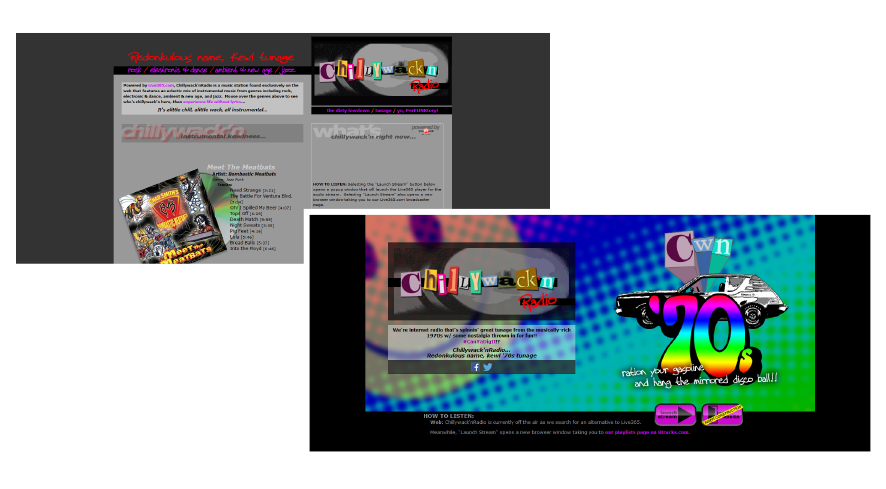
All brand collateral, again with the exception of the logo, was colorful in varying promotional themes in order to reflect the cultural richness of the “groovy ‘70s.”
SOLUTION
COLOR PALETTE
Chillywack’nRadio
The client opted to keep it generally low key using grays and black but with intermittent “pops” of color. The logo is an excellent example of this, but many of the promotional items used by the station varied widely in color to fit a given theme.
In addition to the LP record, the logo text was also shown against different black and white backgrounds while remaining consistent with the musical motif. The feature was primarily designed for the website to display different backgrounds each time the user viewed the homepage, enforcing the idea of varied forms of music.
CWN70s
All brand collateral, again with the exception of the logo, was colorful in varying promotional themes in order to reflect the cultural richness of the “groovy ‘70s.”
LOGO/VISUAL IDENTITY
Chillywack’nRadio
Conforming to the theme of eclecticism, the “Chillywack” and “n” text resemble a ransom note with piecemeal print lettering. “Radio” and apostrophe text invoke the idea of neon. All text is set against a low key abstract image of an LP record.
In addition to the LP record, the logo text was also shown against different black and white backgrounds while remaining consistent with the musical motif. The feature was primarily designed for the website to display different backgrounds each time the user viewed the homepage, enforcing the idea of varied forms of music.
CWN70s
Because we already had an understanding of the client’s service from the previous branding effort, we just needed to research various aspects of the decade such as historical events, trends, slang, etc.
MESSAGING
Chillywack’nRadio
Casual and hip, e.g. “Alittle chill, alittle wack, all instrumental”
CWN70s
Maintains same casual and hip idea, but includes references to era-specific culture, e.g. “ration your gasoline and hang the mirrored disco ball!!”

NetdawgieDotCom

CONTEXT
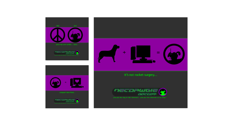
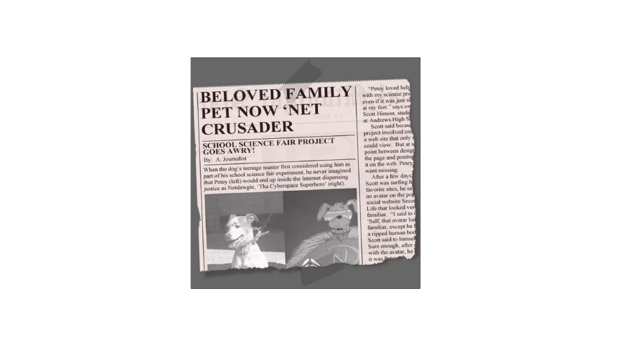
Imagine a dog’s head on a superhero’s body, that’s Netdawgie: Tha Cyberspace Superhero. *
The client’s concept behind NetdawgieDotCom is online comic, with the backstory of a dog inadvertently removed from the physical world and immersed into the binary (and dangerous) realm of computers and the internet.
* comic illustration by Joe Stepp
CHALLENGE
In the highly saturated market of online entertainment, the client wanted to have a stand-out presence that would be as impactful as the work Netdawgie does to protect us from cybervillains.
CONCEPT
While doing research for this project we found the work of many of our client’s competitors to be cutesy, sarcastic, or relating to everyday existence. The colors used were largely pastel-ish in their layouts.
NetdawgieDotCom is starkly different. The storyline is the classic tale of good versus evil in a familiar yet somewhat strange setting, and the color combinations are in-your-face bold.
So, to properly brand NetdawgieDotCom, we knew its presence needed to be as brash, unusual, and electric as the character itself, but still in keeping with the cheekiness the client’s demographic appreciates.
SOLUTION
COLOR PALETTE
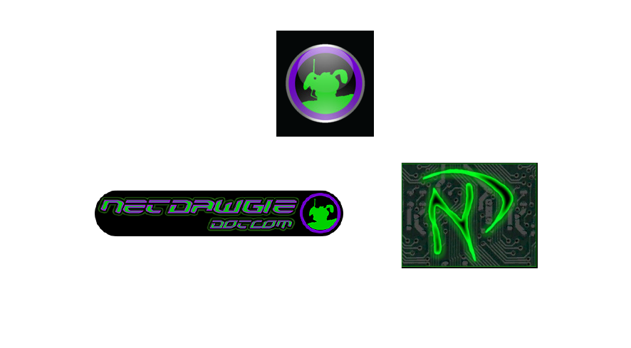
For this project, identifying the appropriate color palette was a simple task, as the colors already used by the client for the main character’s costume lent themselves well to the theme of “amplified peculiarity”. So, neon greens and purples as high keys, and grays and black for low key contrast were selected.
LOGO/VISUAL IDENTITY
Conforming to the idea of high tech and otherworldy, 1) rounded and hexagonal shapes were included, 2) a futuristic typeface was used, and 3) Netdawgie’s floppy-eared head in high key silhouette was inserted.
Additionally, it was decided the stylized “ND” emblazoned on Netdawgie’s chest would be utilized as an identity feature.
MESSAGING
Quirky, with a touch of throwback, (the tagline which reads, “You put my dog in the internet!! You put the internet in my dog!!”) is a nod to the successful Reese’s marketing campaign of the 1970s and ‘80s.